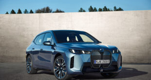
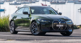
Some of BMW’s designs have recently come in for harsh criticism. Compared to the company’s conventional looks, several of the newest models from the Bavarian brand seem odd. To put it mildly, they’re an acquired taste. For one, we have the massive grille on the front fascia of the BMW iX – and that’s only one part of the puzzle when it comes to styling. It’s enormous and has sleek, angular forms on the body, making the electric SUV aerodynamically efficient.
That’s pretty understandable, given that the majority of electric vehicles take this route. And when range anxiety rises as a significant issue, you have to try anything to get the most miles out of the battery pack. Many have already reviewed the iX, and they nearly all say the same thing – the iX isn’t as awful as they seem. They’re right because it’s more about substance than style with this automobile. But what if you’re unable to accept the way it’s been designed?
If you’re wondering how the BMW iX would look if designed differently, then keep reading. In this video by The Sketch Monkey, they did the iX some makeover, taking inspiration from the i4’s styling cues. Beginning with a critique of the iX’s current design, the video goes on to point out some of the aspects that set it apart from competitors.
It so appears that The Sketch Moneky’s solution is sticking the i4’s front end in there. As a result, it seems to be distinct. Did it work? To some extent, that’s a matter of personal preference. After all, design is highly subjective. The i4 headlights give it a more recognisable appearance, with the corona rings evoking memories of an old-school BMW.
 BMW.SG | BMW Singapore Owners Community The Ultimate BMW Community – Established Since 2001


